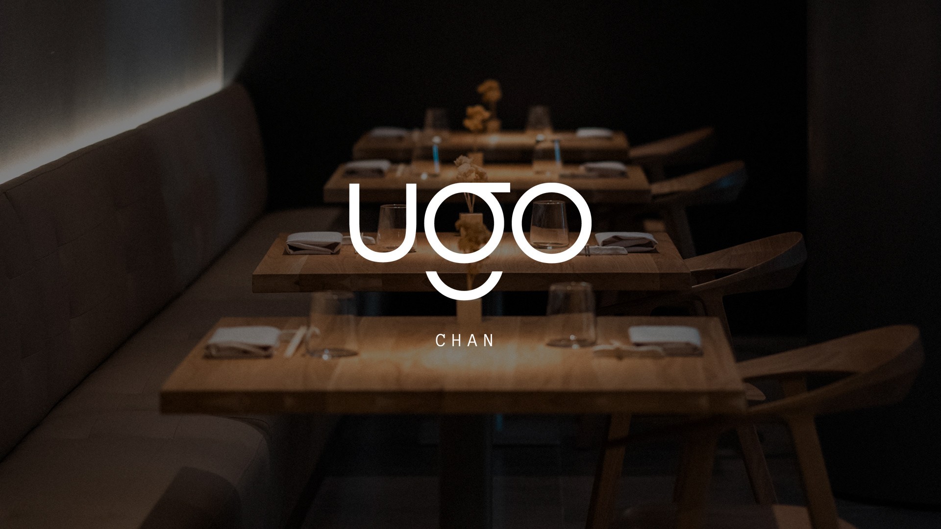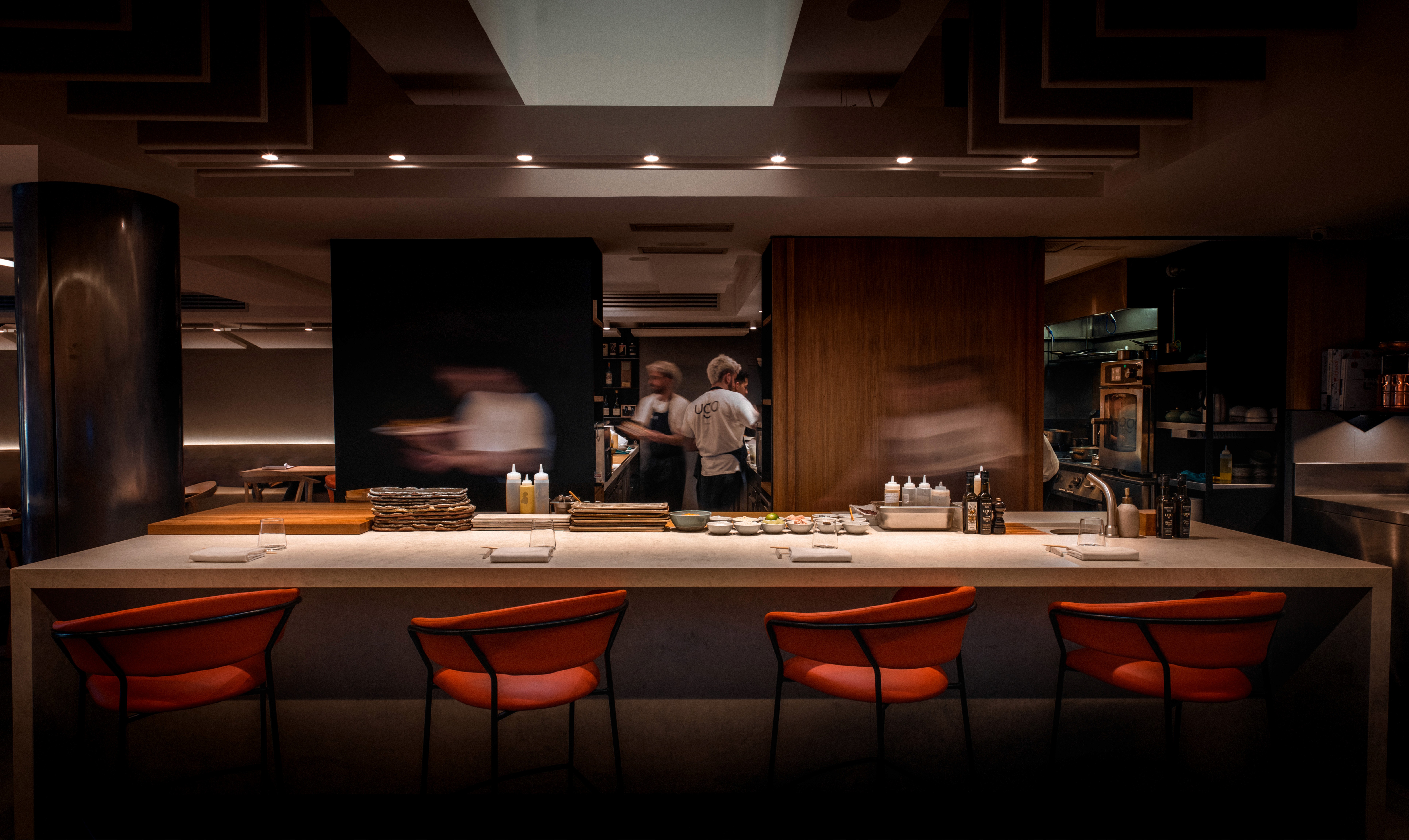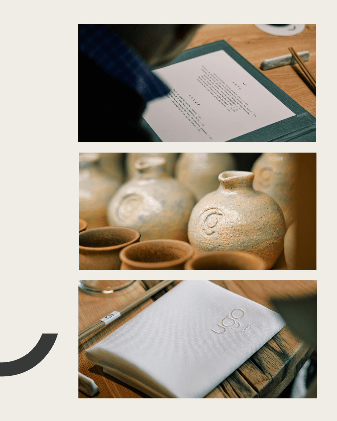
El reto era traducir la cocina de Hugo Muñoz —puro producto, técnica y cero postureo— a una identidad que se sintiera igual de honesta. Ugo Chan necesitaba una marca que fuera elegante pero que no diera miedo entrar, mezclando ese punto minimalista japonés con el carácter de España.
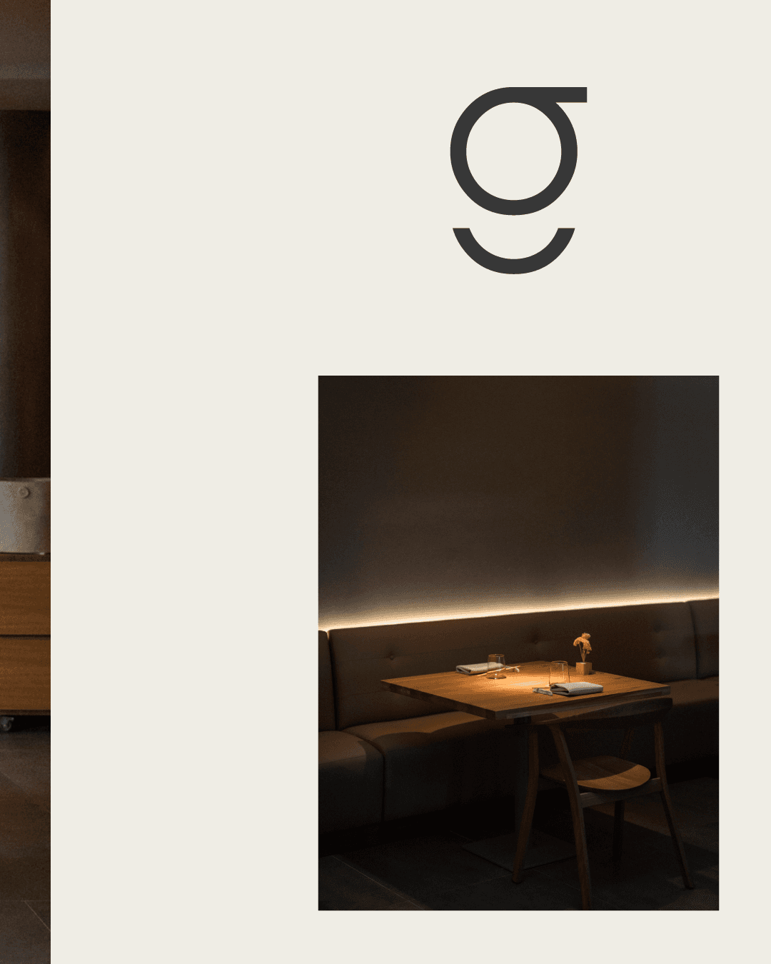
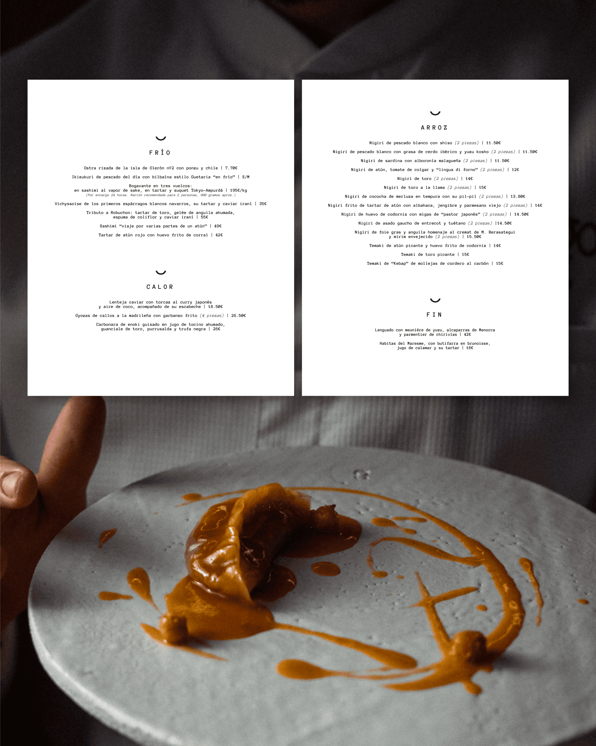
Para conseguirlo, creé un sistema visual limpio que funciona en todas partes. Diseñé un logotipo sencillo, elegí una gama de colores que no distrajera de lo importante (la comida) y desarrollé una web donde reservar fuera lo más fácil del mundo. Al final, todo —desde la carta del restaurante hasta el feed de Instagram— habla el mismo idioma: el de un restaurante que se toma muy en serio lo que hace, pero sin complicaciones.
——————-
The challenge was translating Hugo Muñoz's cuisine—pure product, technique and zero pretense—into an identity that felt equally honest. Ugo Chan needed a brand that was elegant but not intimidating to enter, blending that Japanese minimalist touch with Spanish character.
To achieve this, I created a clean visual system that works everywhere. I designed a simple logo, chose a color palette that didn't distract from what matters (the food) and developed a website where making a reservation was the easiest thing in the world. In the end, everything—from the restaurant's menu to the Instagram feed—speaks the same language: that of a restaurant that takes very seriously what it does, but without complications.
Categoría:
Branding - Web Design
Cliente:
Ugo Chan Restaurant
Duración:
4 - 8 Weeks
Localización:
Madrid